The object of this exercise was to find fairly compact locations and to take photographs in the vertical plane. Once these photographs were taken the object of the exercise was to evaluate if these images work better in the horizontal or vertical plane and if I deliberately saught tall subjects.
Photograph 1: Vertical
I didn't think about this photograph much when composing it. I was curious if a narrow street scene would work better horizontally or vertically.
Photograph 1: Horizontal
I'm not sure this photo works in either plane as I don't think it adheres to the Golden section rule at all. If I were to chose which photo works better I would say the horizontal as I think the eye is lead down the street more effectively in this photo.
Photograph of Norwich Castle as seen from below. I took this shot thinking that because it is a rectangular object it would work best in the horizontal plane.
Photograph 2: Vertical
However, I think the photograph works much better in the vertical plane as I think the eye is lead from the bottom of the frame to the Castle at the top. I think the photo is much more balanced with the frame divided into three distinct areas.
Photograph 3: VerticalI like this photograph and think the slight movement of the people in the foreground works well.
Photograph 2: Vertical
However, I think the photograph works much better in the vertical plane as I think the eye is lead from the bottom of the frame to the Castle at the top. I think the photo is much more balanced with the frame divided into three distinct areas.
Photograph 3: Vertical
Photograph 3: Horizontal
I don't think this scene works well in this plane as to incorporate the building I needed to take the picture without so much of the pavement in frame. I think this upsets the composition and balance of the photo.Photograph 4: Vertical
I took this photo of Norwich Castle Mall quickly and without really composing the shot as I was on the other side of a busy road.
Photograph 4: Horizontal
 I don't think this photograph works well in either orientation. I think the horizontal version is slightly better balanced and has more interest as you can see more in the frame and put the picture into context.
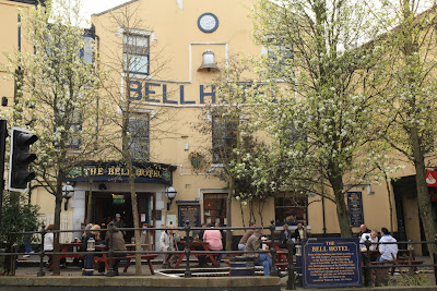
Photograph 5: Vertical
 I quite like this photo of the Bell Hotel in Norwich. I think it works well in the vertical and has nice balance from the trees either side of the hotel and also horizontally with the pavement in the foreground, the seating outside the hotel and the hotel itself.
Photograph 5: Horizontal
I don't think this subject works quite as well in the horizontal plane as you lose some balance with the top of the building and the lower pavement missing from view.
Photograph 6: Vertical
 When I took this shot I thought a narrow street scene like this would work better in the vertical position as the walls are steep and high.
Photograph 6: Horizontal
 I think I was correct in my assumption with this shot. Although I don't particularly like the photograph I think it works better in the vertical plane.
Photograph 7: Vertical
 Another street scene, this time slightly wider. I assumed that this would work better in the vertical plane also.
Photograph 7: Horizontal
However, because the scene opens out toward the foreground I think the shot works better in this plane and is much more balanced. Photograph 8: vertical
I took this photograph without thinking about it too much. I wasn't sure which plane would work best.
Photograph 8: Horizontal
I think if I had framed the horizontal photograph a little better then this would have worked quite well as it seems to have better balance than the vertical photo and nearly adheres to the Golden section rule with the tables running down just off centre and the vertical line of the building in the background.Photograph 9: Vertical
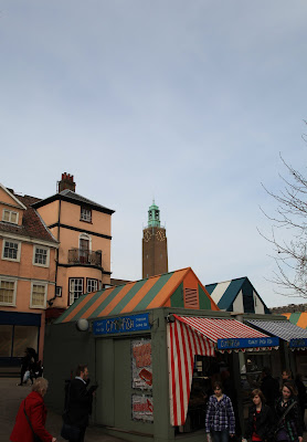
I took this photo of Norwich Forum as I liked the pavement in the foreground leading the eye passed the people to the main subject.Photograph 9: Horizontal
I originally thought this photograph would work better in the vertical plane but changed my mind when viewing the finished shots. I think it has better balance in the horizontal with the three distinct sections of the building on the left the forum itself and the church on the right.
Photograph 9: Vertical
 This is another shot where I wasn't sure which plane would suit the composition. I was unable to shoot the entire building from my position and with the widest setting on my lens. However, I do like this photo and think the balance works well adhering to the golden section rule well. I also like how the photo is weighted toward the bottom of the frame.
Photograph 9: Horizontal
I don't think I composed this photograph very well which is why in my opinion it doesn't work as well as the vertical photo.
Photograph 10: Vertical
 Another shot of the same church in Norwich. This time I composed the shot without the tower to see if this changed how well the photo worked in differing planes.
Photograph 10: Horizontal
 I don't think either composition is very good but think the horizontal plane works best when the tower is not in view. This might be in part due to the shape of the building.
Photograph 11: Vertical
 I was now deliberately seeking tall buildings thinking that these types of subjects would always work better in the vertical frame. I'm not sure if this shot works particularly well and proves that a photograph needs to be balanced and adhere in principle to the golden section.
Photograph 11: Horizontal
Photograph 12: Vertical
Picture 12: Horizontal
I'm not sure which photo works the best here. I like the vertical plane as it emphasises the ceiling and feels quite narrow. However, I like the horizontal shot as well as it seems to lead the eye down the row of shops more effectively.
Photograph 13: Vertical
I have cropped this shot to emphasise the man holding the sign. When composing the shot I didn't have the confidence to move closer and take the picture (something I must get over). I think the photo is amusing and works well in the vertical plane.Photograph 13: Horizontal
Even though this photograph has more context to it I still prefer the vertical shot.
Photograph 14: Vertical
I took this photo of a sign because I assumed it was already in the vertical plane it would look best shot in the vertical.Photograph 14: Horizontal
I think my assumption was correct I think this scene works much more effectively in the vertical plane.
This exercise has been extremely difficult but has made me think about the format of the shot I'm taking. I think with a little effort most scenes should be made to work both vertical and horizontal. I think it takes a little more effort to compose a scene in the vertical plane and the results are not always as successful as then horizontal image. Format is largely a matter of habit.


