First I wanted to research how this type of narrative is used in a commercial setting (e.g magazines, etc.). The most famous use of narrative in a magazine was Life magazine. Life magazine let the images tell the story with only the minimum amount of text to link the images. One of the most famous photographers for LIfe was W Eugene Smith. One such story was the Country Doctor - During a period when many remote US communities had limited access to medical services, with a national shortage of country doctors, life magazine profiled Ernest Guy Geriani - a 32-year-old GP serving the small town of kremmling and its outlying hamlets in the Rocky Mountains. W Eugene Smith photographed Ceriani working around the clock, throughout the year.
 |
| From the Country Doctor by W Eugene Smith (Life Magazine) |
I know I wouldn't be able to emulate the great photographers of Life magazine but wanted to do something in a similar style and also bringing it up to date. I therefore decided to produce an online magazine. I photographed a recent trip I took to Munich to the Christmas Markets. I created a web site http://munchenmarkets.tk and included the images and a small amount of text linking the photos. I also included a slide show of a number of images to bring the site up to date. The site has four pages which each have a different theme (these can be navigated to from the top of the first page) Munich, the Markets, Gluhwein and food.
The images I have chosen for the magazine article are:
Photograph 1:
 |
| Canon EOS 5D Mark II EF 85mm F/1.8 USM lens, 85mm, f/9.0, 25.0s, ISO125, Flash mounted on camera |
Photograph 2:
 |
| Leica Camera AG M8 Carl Zeiss Biogon 2,8/28 ZM Lens, 28mm, f/2.8, 1/15, ISO320 |
Photograph 3:
 |
| Leica Camera AG M8 Carl Zeiss Biogon 2,8/28 ZM Lens, 28mm, f/2.8, 1/180, ISO160 |
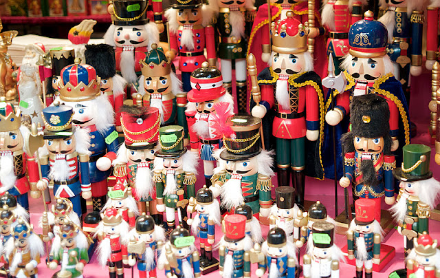
I kept the aperture wide for this shot (the widest my lens would allow f/2.8) not only because I needed the light but also to try and blur the background. I have therefore hopefully got an image with a single point (the Nutcracker) that dominates the composition.
Photograph 4:
 |
| Leica Camera AG M8 Carl Zeiss Biogon 2,8/28 ZM Lens, 28mm, f/5.7, 1/90, ISO160 |
Again I used the natural light from the stall but have used a smaller aperture to try and keep the image sharp. I have tried to use the pattern of the biscuits. However I think a tighter crop might be better.
Photograph 4: Tighter crop
Photograph 5:
 |
| Leica Camera AG M8 Carl Zeiss Biogon 2,8/28 ZM Lens, 28mm, f/4.8, 1/30, ISO160 |
Another busy photograph but I thought it displayed the busyness a clutter of the Market and also added some human interest.
Photograph 6:
 |
| Leica Camera AG M8 Carl Zeiss Biogon 2,8/28 ZM Lens, 28mm, f/3.4, 1/125, ISO160 |
I wanted to show pattern and also use the strong colours of these toffee apples.
Photograph 7:
 |
| Leica Camera AG M8 Carl Zeiss Biogon 2,8/28 ZM Lens, 28mm, f/2.8, 1/60, ISO160 |
Another attempt to use pattern in this photograph.
Photograph 8:
 |
| Leica Camera AG M8 Carl Zeiss Biogon 2,8/28 ZM Lens, 28mm, f/8.0, 1/60, ISO1250 |
I converted this image to black and white as I shot it at a small aperture to keep everything sharp. The cameras ISO setting was automatic and it therefore has quite a lot of noise. However, I do think this adds a little to the atmosphere of the image.
Photograph 9:
 |
| Leica Camera AG M8 Carl Zeiss Biogon 2,8/28 ZM Lens, 28mm, f/3.4, 1/125, ISO160 |
Even though this image is quite dark I still think it works in showing the atmosphere of the market!
Photograph 10:
 |
| Leica Camera AG M8 Carl Zeiss Biogon 2,8/28 ZM Lens, 28mm, f/3.4, 1/4, ISO160 |
I love the use of the colour in this image from the artificial lighting and the colour of the dark drink against the snow. I also like the out of focus highlights (Bokeh) in this image.
Photograph 11:
 |
| Leica Camera AG M8 Carl Zeiss Biogon 2,8/28 ZM Lens, 28mm, f/3.4, 1/20, ISO160 |
Another dark and atmospheric shot showing the busy market food stalls. I like how the snow falling is highlighted from the lights of the 'BratHausle' stall and the coloured lighting.
Photograph 12:
 |
| Leica Camera AG M8 Carl Zeiss Biogon 2,8/28 ZM Lens, 28mm, f/6.7, 1/90, ISO160 |
I used pattern again to aid the composition of this image and help to lead the viewer into the image.
